Ingredients of "Cipher Salad"

written by: Rachel, Leo, Janis, and Lisha • Oct 13, 2020 • category: dev • 1312 words • ~ 7 minute read • Subscribe to RSS feed for blogs
We prepared Cipher Salad in collaboration with ACM Cyber and CityLab at UCLA as an introductory cryptography mini lesson for students of all ages. Cryptography is one of those subjects that can intimidate even a college CS student (ourselves included!), but it’s an important part of CS, and we wanted to make it accessible to as many people as possible.
Particularly, we wanted to ease students into cryptography in a fun and engaging way so that anyone without a CS or math background could benefit. Creating an interactive mini web app allowed us to not only get creative in the way we presented the material, but also enable students to learn CS regardless of our ability to physically be there with them. With the consequences of COVID-19, this has been especially important. In fact, at the conclusion of the project, CityLab at UCLA used Cipher Salad in a virtual cyber day for high schoolers!
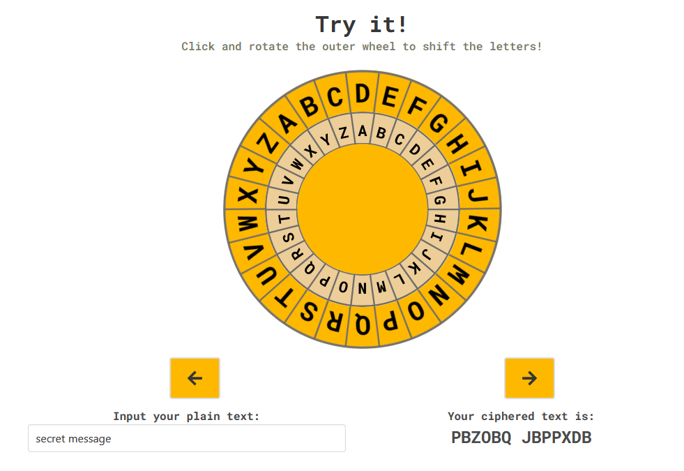
Cipher Salad is a combination of many cipher modules combined with a game at the end where users can share and crack ciphers with their friends. We covered three types of ciphers and other simplified cryptography concepts, and included graphics and animations to keep students of all ages engaged. The Caesar cipher, also known as the shift cipher, is one of the simplest and most widely known encryption techniques. The Atbash cipher reverses every letter in the alphabet, and lastly, there’s the Vigenere cipher, which is a little more advanced, for kids to further explore the fun of cryptography.

Alyssa, Teach LA’s dev and cybersecurity extraordinaire, was the ~key~ to the content creation and presentation (and she coded quite a few features!). She developed the lesson from scratch and created mock-ups using Figma, an online design prototyping tool. This enabled our developers to focus on the development side of things. Those of us who consider ourselves to be design challenged (aka Lisha) particularly appreciated this. Alyssa also taught much of the content to the developers, who, as it turns out, were also cryptographically challenged and weren’t familiar with some basic ciphers. This is a great example of Teach LA’s motto, learn what you teach, teach what you learn!
On the development side, we used React as the main framework to create Cipher Salad. To aid in styling the user interface, we incorporated the Bulma framework for built-in CSS classes. We also included other npm packages (such as React Anime, a React binding for Anime.js, and Typed.js to add animations and improve the visual presentation of the overall site. Additionally, we connected the share cipher module, which includes the functionality to create and crack ciphers, to a Firebase backend for storing and retrieving. Finally, we included a floating vertical navbar to provide users with a sense of progress through the module. This proved to be more complicated than anticipated.
You see, to create a scrollbar tracking progress throughout the page, your React component has to have knowledge of all the other elements on your webpage so that it can detect when the user scrolls by one. In the world of React, this isn’t ideal, since we would be violating the core assumption that React apps are divided up into discrete components. However, to achieve the functionality we desired, there aren’t many other options.
So the question then became “how should we best break React’s rules?” To ease this process, we used a small react component react-scrollspy, which allowed us to construct a simple wrapper around the component that did the heavy lifting of spying on the user’s scrolling, then update our little key icons every time a user scrolled by. In retrospect, one could construct a dependency free version of this component by using React DOM to instead track the user’s scrolling directly. This would offer the developer more control over the finer details of the “scroll spying” behavior while sacrificing a negligible amount of code readability.
We encountered several other difficulties throughout development. One of the major obstacles was our lack of experience in web development – at the start of the project, we hardly knew any HTML and CSS. Before we were able to make any substantial progress, we needed to become comfortable with HTML, CSS, JavaScript, and React. With the help of our stellar dev leaders Matt and Leo, various online tutorials, and lots of time struggling, we finally overcame the learning curve. A particularly helpful resource was the Learning Lab Crash Course conducted by Matt and Leo over the summer.
Once we got the hang of things, it was time to dive into building the module. One portion we found tricky to implement was the decoding section that gives users an encoded message, options for decoding it, and demonstrates the correct decoding. One of the hard parts was getting used to React Anime. Although React Anime and Anime.js seem rather straightforward in hindsight, we initially found them unintuitive, partly because we weren’t familiar with some of the underlying concepts such as keyframes, which is a CSS styling property for smooth transitions and animation effects. Keyframes define the starting and ending points of the “frames” and other properties such as frame opacities and animation direction. We also used transition effects throughout the cipher salad to make individual sections more engaging. In addition, while React Anime often makes animations with React easy to implement, it led to an issue with certain animations. The problem was that the animations done with React Anime components would replay every time the component containing them was rerendered (since that causes the enclosed Anime components to be redrawn). In most cases, we only wanted those animations to play once. Fixing this required some extra logic with state that determined whether to render the animated element or the static element. Unfortunately, this meant that we could no longer rely on using React Anime’s delay prop for staggering animations – doing so would result in each animation being replayed every time the component renders. Instead, each animation had to be triggered by a state change, which meant that staggering animations required staggering state changes using callback functions. As a result, the rendering logic for the entire component was more complicated than we expected, and writing it made our brains hurt a little.
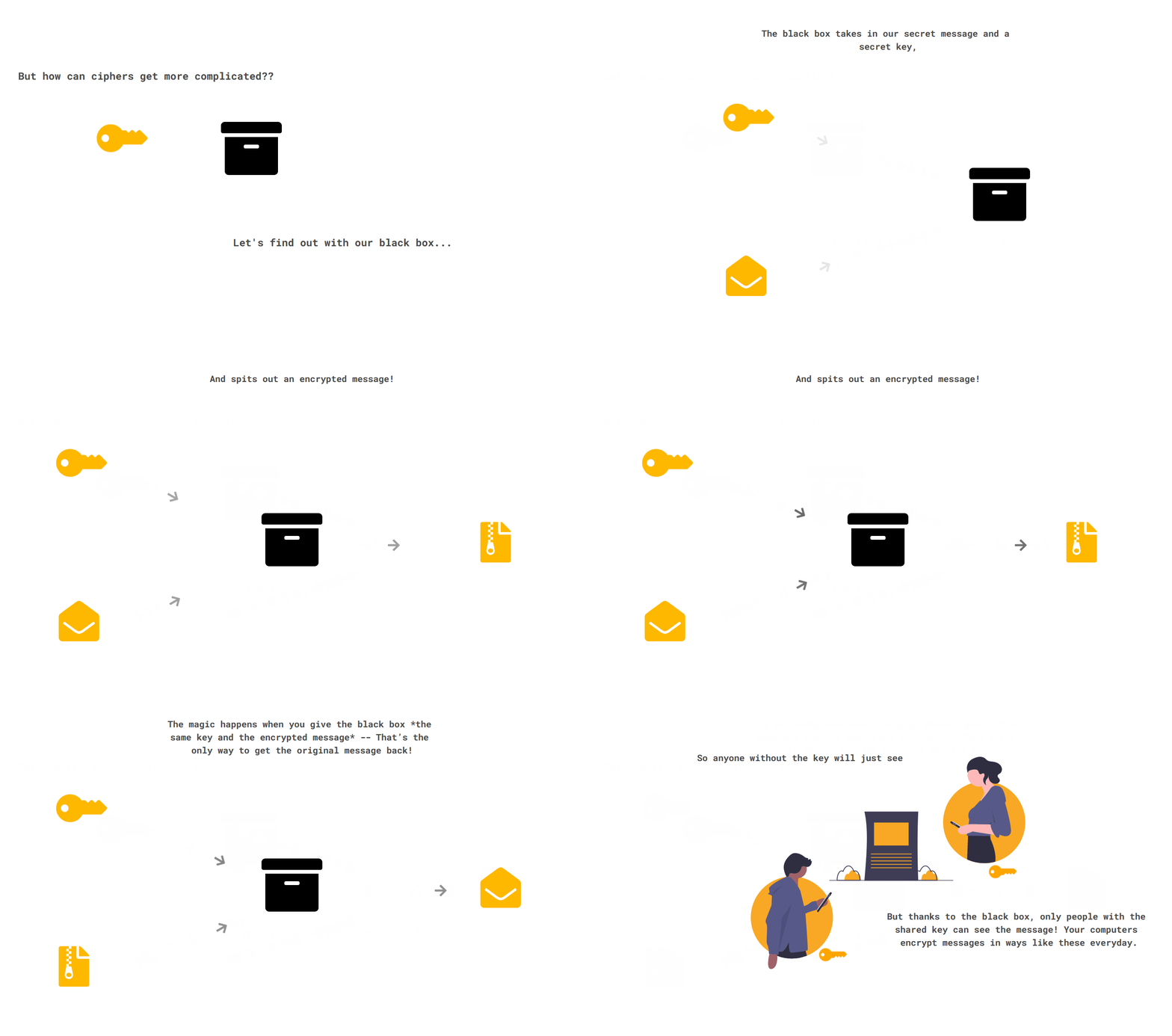
Another issue we encountered was making sure our app looked good on all screen sizes. This was important to us since we couldn’t make any assumptions about what devices students might use to access our site. To ensure a quality experience whether students view it on double monitors or a small tablet, we made sure to test the site on different viewports throughout development. However, we had a lot of trouble with the layout of the blackbox example. Initially, pixel measurements were used to position elements and animated icons elegantly, but we had trouble making everything look aligned on different viewport sizes, as absolute measurements don’t adapt to various sizes. As a result, we switched to relative units, and we made extensive use of CSS media queries to ensure that certain elements wouldn’t overlap on smaller viewports.

In the process, we were able to learn from our mistakes, make adjustments, and be open to suggestions from other people. Finally, through trials and errors, we resolved the problems and finalized an intuitive and presentable site.
Creating Cipher Salad has been a tremendous learning opportunity for all of us. Throughout the development cycle, we learned new technologies and tools to help us further our skills in web development. We also practiced our ability in creating content that’s understandable, well designed, and engaging for all ages. We hope everyone can enjoy our tasty Cipher Salad, and we’re always open to new suggestions for improvements. Cheers!


