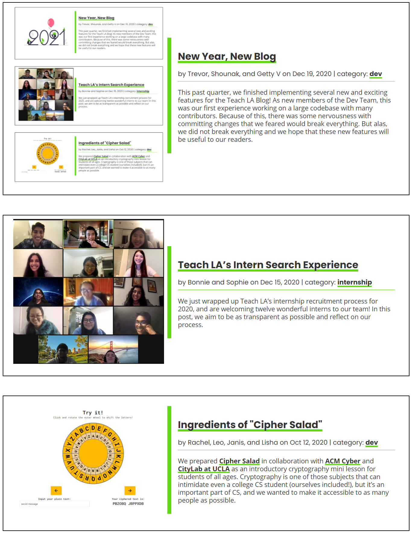
New Year, New Blog
written by: Trevor, Shounak, and Getty V • Jan 4, 2021 • category: dev • 1217 words • ~ 6 minute read • Subscribe to RSS feed for blogs
This past quarter, we finished implementing several new and exciting features for the Teach LA Blog! As new members of the Dev Team, this was our first experience working on a large codebase with many contributors. Because of this, there was some nervousness with committing changes that we feared would break everything. But alas, we did not break everything and we hope that these new features will be useful to our readers.
Related Posts and Post Images
One of the first things we decided to implement was a feature to encourage readers to look into more blog posts by recommending other posts for them. This is a tried-and-tested method to keep guests engaged with the page, as anyone who has fallen into a YouTube spiral can tell you. The recommended posts are shown as cards at the bottom of each blog post, highlighting other posts that might interest them. On our end, each post has a corresponding file that contains the text of the article along with other useful information such as the author, publishing date, categories, and more. As the site generates the recommendations, it looks through these different bits of information to determine which posts are most relevant to the current user. In its first iteration it recommends based on the most posts. However, it can be changed and updated to recommend posts with similar tags or authors in order to improve the relevancy of the recommendations. This algorithm is implemented using Liquid, which allows for processes like for loops and if else statements. Once the algorithm could pick out good posts, we ensured the card visuals matched the style of the rest of the page with CSS. Once we saw the completed recommendation cards we realized one important thing was missing: a thumbnail.

When you scroll through any large content site such as YouTube or a news site, each article or video shows an image with its title and other information. This is very important as it breaks up what would otherwise be a large wall of text, improving readability and making the site more visually interesting. We realized that the addition of images would benefit both the post recommendations as well as the main blog page. First, we had to change the way images were stored in the file structure for each post to make it easy to find the posts’ respective images. The path to the image is stored in the post file along with it’s alternative text, making it easy to access them along with other information like the title or author. Once this system was in place we updated each location the posts are shown to render the images along with the title and author. After a couple of suggestions and changes to the formatting (thanks Matt!), the images feature was done!
Blog Categories
Another classic blog feature is the ability to look for posts based on their categories to quickly find more about specific topics. With this feature, you can click on a category label on a post and be directed to a page listing all the blog posts with the same category. From there, you can easily filter the posts with the topic you’re interested in. In addition, you can also head to the categories home page to see a list of all the topics in the blog.
For this feature, one important aspect was that we wanted category pages to be automatically generated so that we wouldn’t need to manually create new category pages each time a new category was added. To help solve this issue, we created a new template layout for a generic category page, and connected this with a Jekyll plugin that would dynamically generate new category pages from the sample layout. Another tricky aspect was figuring out how to set up the pages to generate with the correct urls, so we consulted the documentation to define a folder for each of the category pages to be located. Finally, to future-proof the category pages, we implemented pagination to limit the number of posts per page so that when the blog eventually grows to hold 100s or even 1000s of posts a user won’t have to scroll forever.
Social Media Buttons
If a reader enjoyed a post and wanted to share it with others, they would have to copy the post’s URL and then paste it wherever they wanted to share it. We wanted readers to be able to share their favorite posts directly from the post so their reading sesh wouldn’t be interrupted. So we decided to add social media buttons to every post which allows for quick sharing directly from the post.
Before implementing the share buttons, we had to read up on some of the APIs released by Twitter and Facebook to understand how the buttons would be implemented on each page. In the blog post layout, we had to insert a couple of scripts which would render the Facebook and Twitter buttons. Displaying them on the page was the easiest part of the implementation. Getting them to share the correct website required us to utilize Liquid. Without Liquid, we would have been forced to hardcode each button’s redirect URL for every post.
When you share a website on social media, you tend to see a related image, the website’s title, and a short description. After getting the buttons to share the correct link, we noticed that there would be a blank preview image in the post. A preview image would give people who see the post an idea of what the article is about. This is where we had to dig into OpenGraph and Jekyll’s SEO Tag (a plugin to help with adding metadata tags). OpenGraph is an Internet protocol for sharing content on sites like Facebook, Twitter, Linkedin, etc. Jekyll’s SEO Tag helps with adding tags for OpenGraph through Jekyll’s front-matter. We were able to take advantage of the post image for the image preview. With a few tweaks, the SEO Tag took the post image and used it in the link preview.
The most painful part of implementing the social media buttons wasn’t programming the code itself. It was debugging. What made debugging a lot harder was the fact that the link previews would use the current ACM TeachLA website. The current website didn’t have the metatags which meant the image previews would be blank. Luckily, there was a way to get around this by committing the code we had written and using Netlify’s preview website. However, this meant we had to change the code and commit very frequently to test the image preview. While it was an exhaustive process, we finally got the previews to display on both Facebook and Twitter.
Final Thoughts
Through lessons with Matt as well as some healthy trial and error, we learned a lot about the fundamentals of the git workflow as well as building with HTML and CSS. In addition to building our technical skills, we increased our confidence in making meaningful contributions to a large project such as the Teach LA website.
We hope you enjoy using these new features the next time you visit the blog!
Authors